Understanding Consumer Surplus and Its Graphical Representation
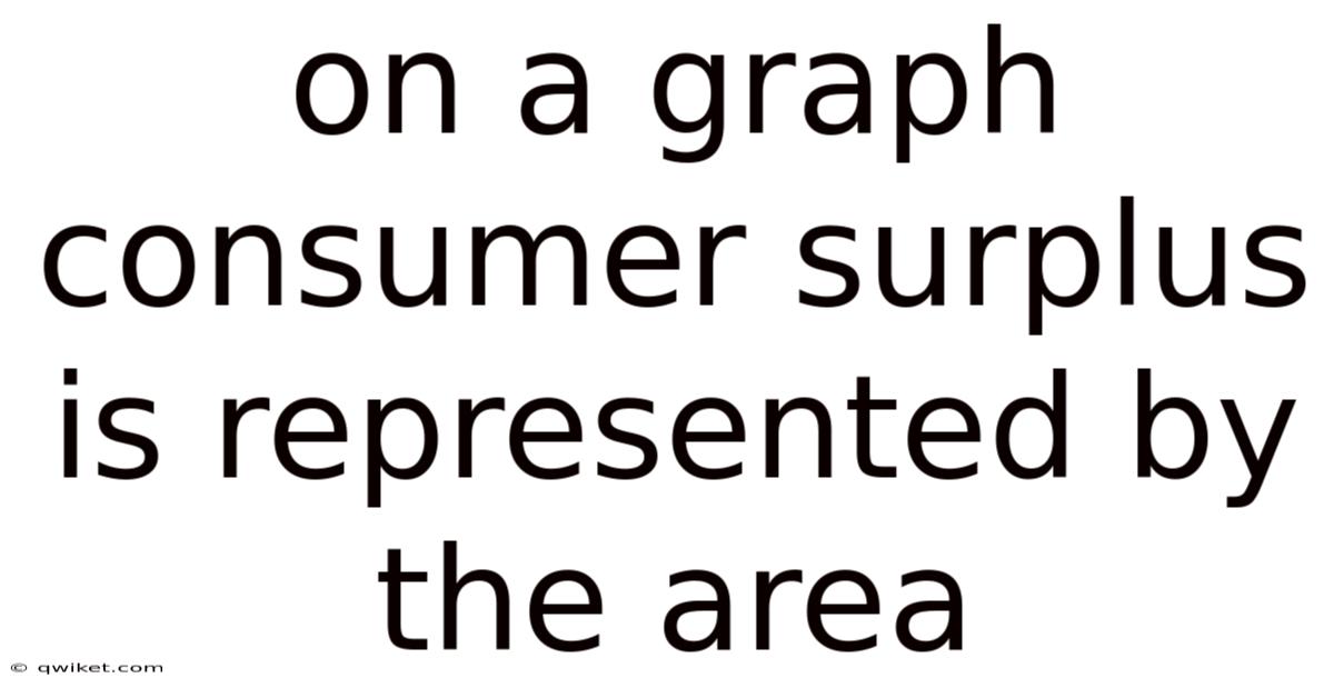
Consumer surplus is a fundamental concept in microeconomics that measures the difference between what consumers are willing to pay for a good or service and what they actually pay. On a standard supply‑and‑demand graph, this surplus appears as a distinct shaded region—the area between the demand curve and the market price line, extending from the origin to the quantity purchased. Grasping how this area is formed, why it matters, and how to calculate it equips students, policymakers, and business leaders with a powerful tool for evaluating market efficiency, welfare impacts, and pricing strategies Easy to understand, harder to ignore. Worth knowing..
Short version: it depends. Long version — keep reading.
Introduction: Why Consumer Surplus Matters
- Welfare Indicator – Consumer surplus quantifies the net benefit that buyers receive from participating in a market. A larger surplus signals higher consumer welfare.
- Policy Evaluation – Governments use changes in consumer surplus to assess the impact of taxes, subsidies, price controls, and trade policies.
- Business Decision‑Making – Companies analyze surplus to gauge price elasticity, identify optimal pricing, and anticipate how market shifts affect their customers.
Because these applications hinge on visualizing surplus, economists rely on the classic price‑quantity graph. The next sections walk through the graph’s components, the mathematics behind the area, and real‑world examples that bring the theory to life.
The Graphical Framework
1. Axes and Curves
- Horizontal axis (Quantity, Q): Represents the number of units of the good exchanged.
- Vertical axis (Price, P): Shows the monetary value per unit.
- Demand curve (D): Downward‑sloping, reflecting the law of demand—higher prices lead to lower quantity demanded. Each point on this curve corresponds to a consumer’s maximum willingness to pay (WTP) for that specific quantity.
- Supply curve (S): Upward‑sloping, indicating that higher prices incentivize producers to supply more.
2. Market Equilibrium
The intersection of D and S determines the equilibrium price (P*) and equilibrium quantity (Q*). At this point, the amount consumers want to buy exactly matches the amount producers want to sell That's the part that actually makes a difference..
3. Defining the Surplus Area
When the market price is fixed at P* (a horizontal line across the graph), every unit purchased up to Q* is valued by consumers at a price higher than P*. The vertical distance between the demand curve and the price line for each unit represents the individual surplus for that unit. Summing these vertical slices from 0 to Q* creates a continuous area—the consumer surplus.
Real talk — this step gets skipped all the time.
Visually, the surplus appears as the region bounded above by the demand curve, below by the price line, and on the left by the vertical axis.
Calculating Consumer Surplus
A. Using Simple Geometry
If the demand curve is linear, the surplus area forms a triangle. The formula is:
[ \text{Consumer Surplus} = \frac{1}{2} \times \text{Base} \times \text{Height} ]
- Base = equilibrium quantity (Q*)
- Height = difference between the intercept of the demand curve on the price axis (the maximum WTP when Q = 0) and the equilibrium price (P*)
Example:
Demand: (P = 100 - 2Q)
Supply: (P = 20 + Q)
Equilibrium:
(100 - 2Q = 20 + Q \Rightarrow 3Q = 80 \Rightarrow Q* = 26.67)
(P* = 20 + 26.67 = 46.
Maximum WTP (demand intercept) = 100.
[ \text{CS} = \frac{1}{2} \times 26.Also, 67 \times 53. 67 \times (100 - 46.In real terms, 67) \approx \frac{1}{2} \times 26. 33 \approx 711 Still holds up..
B. Integrating a Non‑Linear Demand Curve
When demand is curved, the area must be found by integration:
[ \text{Consumer Surplus} = \int_{0}^{Q^{}} \big[ D(q) - P^{} \big] , dq ]
where (D(q)) is the demand function expressed in terms of quantity. This method captures the exact surplus even when the shape deviates from a straight line.
Example:
Demand: (P = 50e^{-0.05Q})
Supply: (P = 10 + 0.5Q)
Solve for Q* numerically (≈ 60).
(P* ≈ 40).
[ \text{CS} = \int_{0}^{60} \big[ 50e^{-0.05q} - 40 \big] , dq ]
Evaluating the integral yields a surplus of roughly $800 (exact value depends on precise Q*).
Economic Intuition Behind the Area
- Marginal Benefit vs. Marginal Cost: The demand curve reflects marginal benefit (MB) to consumers, while the price line reflects the marginal cost (MC) they actually incur. The surplus area is the sum of all positive differences (MB − MC) across units.
- Diminishing Marginal Utility: As quantity rises, each additional unit provides less additional satisfaction, causing the demand curve to slope downward. The decreasing vertical slices illustrate why the surplus area tapers off.
- Consumer Heterogeneity: Though the graph aggregates demand, the area implicitly captures a range of individual valuations—from those willing to pay the maximum price to those whose willingness barely exceeds the market price.
Real‑World Applications
1. Tax Incidence
When a per‑unit tax shifts the supply curve upward, the new equilibrium price paid by consumers rises, shrinking the surplus area. That's why the reduction in consumer surplus, together with the increase in producer surplus (or loss), quantifies the tax burden borne by each side. Policymakers often use this analysis to design taxes that minimize welfare loss.
2. Price Ceilings
A legally imposed maximum price below P* creates a new horizontal line lower than the equilibrium price. The consumer surplus expands only for the units still supplied; however, a shortage emerges because quantity demanded exceeds quantity supplied. The graphical surplus area now consists of two parts: a triangle up to the ceiling price (actual surplus) and a “deadweight loss” triangle representing lost welfare.
3. Technological Innovation
If a breakthrough reduces production costs, the supply curve shifts rightward, lowering P* and raising Q*. The price line drops, expanding the consumer surplus area dramatically. This visual change helps illustrate why consumers often benefit more than producers from productivity gains.
4. International Trade
Opening a market to imports effectively introduces a lower world price line. Domestic consumers gain a larger surplus area, while domestic producers may lose surplus. The net change—consumer gain minus producer loss—determines the overall welfare effect of trade.
Frequently Asked Questions
Q1. Does consumer surplus include the value of goods that are not purchased?
No. Consumer surplus measures the benefit from the units actually bought. The area above the price line but to the right of Q* (unbought units) does not count because those consumers chose not to purchase at the market price.
Q2. Can consumer surplus be negative?
In a standard market with a downward‑sloping demand curve, the surplus is non‑negative because every purchased unit has a willingness to pay at least as high as the market price. On the flip side, if a price floor forces buyers to pay more than their willingness to pay, the “effective” surplus for those units could be considered negative, indicating a loss of welfare Small thing, real impact..
Q3. How does consumer surplus differ from total utility?
Total utility aggregates the satisfaction from all units consumed, regardless of price. Consumer surplus isolates the extra utility gained because the market price is lower than the maximum willingness to pay. It is a net measure, while total utility is a gross measure Simple, but easy to overlook. Took long enough..
Q4. Why do economists prefer the area method over simply adding up individual willingness‑to‑pay values?
The area method provides a continuous, visual, and mathematically tractable way to capture the aggregate surplus without needing data on each individual’s exact WTP. It works well with functional forms (linear, exponential, etc.) and aligns with calculus tools used in welfare analysis Worth keeping that in mind..
Q5. Does consumer surplus apply to public goods or non‑market transactions?
The concept can be extended, but the graphical representation relies on market‑determined price and quantity. For public goods, analysts often estimate a hypothetical demand curve to compute a “willingness‑to‑pay” surplus, but the lack of a market price makes the area interpretation more abstract Easy to understand, harder to ignore. Simple as that..
Common Mistakes When Interpreting the Graph
| Mistake | Why It Happens | Correct Interpretation |
|---|---|---|
| Confusing the price axis intercept with equilibrium price | The intercept shows the highest possible WTP, not the actual transaction price. | Use the intercept only to determine the height of the surplus triangle, not the market price. |
| Adding the area above the demand curve | Some think any area above demand is surplus. In real terms, | Surplus is only the area between the demand curve and the actual price line, up to the quantity bought. Think about it: |
| Ignoring the quantity axis as a boundary | Overlooking that surplus stops at Q*. | The left boundary is the vertical axis (Q = 0); the right boundary is Q*. In real terms, |
| Assuming surplus is the same for all consumers | The graph aggregates heterogeneous preferences. | Individual surplus varies; the total area is the sum of all individual differences. |
Step‑by‑Step Guide to Plotting Consumer Surplus
- Draw the axes – label price (P) on the vertical and quantity (Q) on the horizontal.
- Plot the demand curve – start from the price intercept (maximum WTP) and slope downward.
- Plot the supply curve – begin at the cost intercept and slope upward.
- Identify equilibrium – mark the intersection (P*, Q*).
- Draw a horizontal line at P* extending from the vertical axis to Q*.
- Shade the area between the demand curve and the horizontal price line, from Q = 0 to Q = Q*.
- Label the shaded region “Consumer Surplus” for clarity.
Following these steps ensures a clean, interpretable graph that clearly communicates the surplus concept.
Conclusion: The Power of a Simple Area
Consumer surplus, represented as the shaded region between the demand curve and the market price line, transforms abstract utility theory into a tangible visual tool. By mastering the graph, the underlying mathematics, and the real‑world implications, students and professionals can quickly assess welfare changes, evaluate policy proposals, and make informed pricing decisions. But whether you are calculating a triangle’s area for a linear demand or integrating a curved function for a more complex market, the essence remains the same: the area captures the extra value consumers receive because the market price is lower than what they are willing to pay. Recognizing and correctly interpreting this area equips you with a versatile lens through which to view the health and efficiency of any market.